CTRL Energy Gum

role.
project lead.
graphic designer
type of project.
branding. packaging design. 3d visualisation. motion design
timeline.
2024
client.
self initiated
about the project.
CTRL Energy is a self initiated packaging design project for a novel caffeinated chewing gum product which offers a solution to the problem of littering. This solution comes in the form of a dual compartment design, where the gum sits on one end, and the chewed gum (to be disposed of) sits in its own temporary compartment. This is a full end to end product concept including: an innovative product design, packaging design, branding and marketing campaign, as well as an array of colourful mascots to accompany the new product.
THE CTRL BRANDing
In establishing the brand behind CTRL Energy Gum, it was important to maintain a youthful and bright design language throughout, as the core consumer base of any chewing gum tends to be young people. In this sense, it was also important to analyse the competitors in the market and aim to produce something novel which would disrupt the established market. When designing the logo, I considered critically how it would work in the final packaging design, and in that sense the logo and packaging design were designed in tandem really.
character design and illustrations
To appeal to young people in the UK and worldwide, a cast of easily identifiable characters were designed as a means to market the product and create a design system which would easily differentiate the product from others on the market. As well as make the flavours easily identifiable between themselves, as they are then tied to identifiable personified characters. I designed the characters in 2D before bringing them to life in 3D and animating them.
Character Illustrations
bubblegum girl
bubblegum girl
freshmint boy
Blackberry girl
3D Renderings. cinema 4d+redshift
outter Packaging Design development
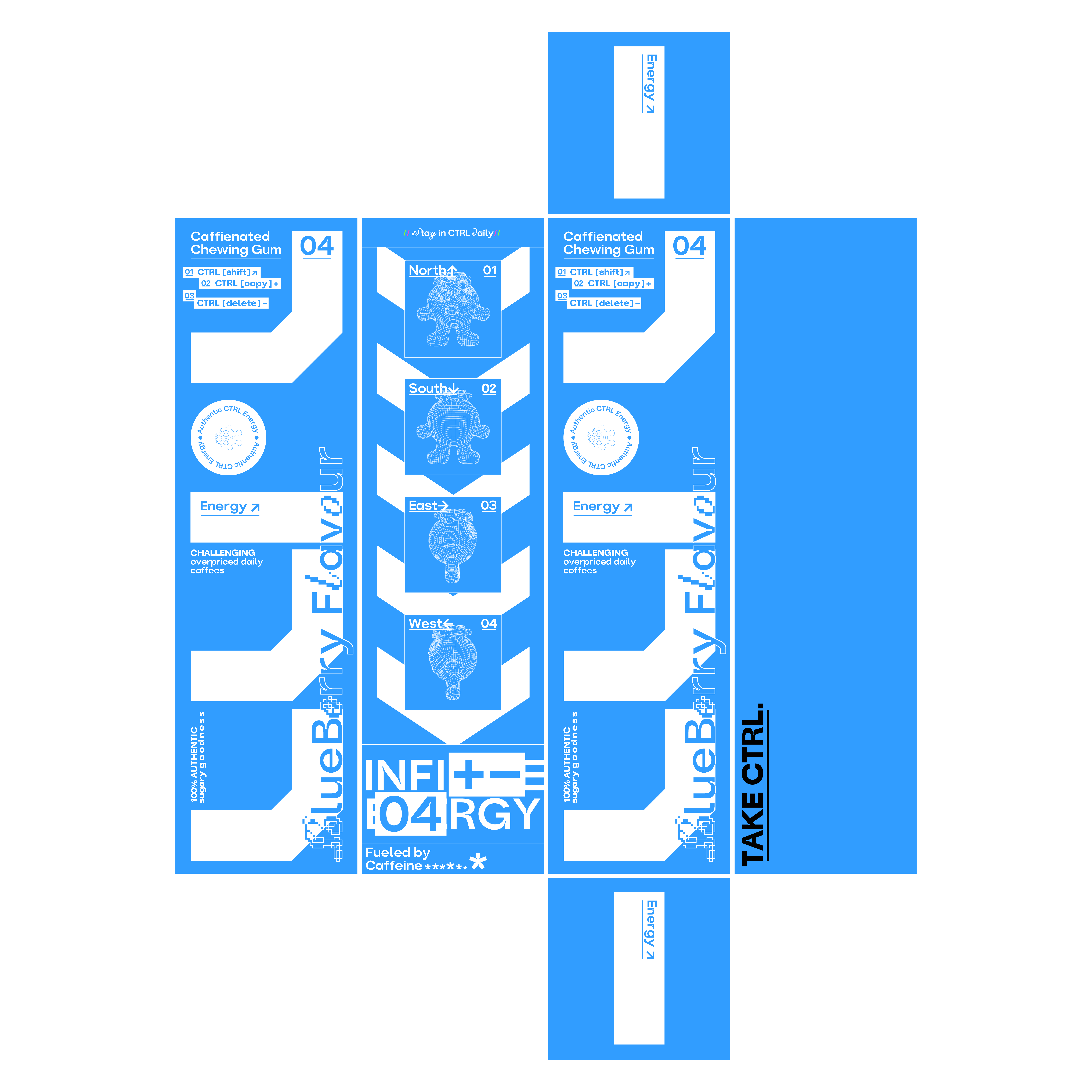
For the outter packaging, the most important consideration was to have a fully recyclable box which would catch the attention of an average shopper in a supermarket setting. The designs follow the same 4 tone colour scheme which carries throughout, and the infographics on the back help to enforce the brand ethos as well as explain the core concept behind the new product. Compared to the Inner product design, the outter cardboard box is a fairly stripped back and minimalist design, which I think is necessary to offset the audacious inner product design.
Outter Packaging Nets
infographics. for the back of the box
3D Renderings. cinema 4d+redshift
inner Packaging Design development
The design for the inner product packaging is far more complex. The product is split into 2 distinct sides, serving different purposes. The clear plastic side: to contain the included sweets. The coloured plastic side: to contain the disposed off sweets after consumption. Crucially, the concept behind the design allows the 2 sides to split and be interchanged between the different flavours using a rail mechanism which is unlocked when the top or bottom lids are opened. The product is small enough to fit inside your pocket, at approximately 12cm tall.
Inner Packaging Nets
3D Renderings. cinema 4d+redshift
CTRL Switching animation. social media campaign
Advertising and campaigning
Born in Hackney, CTRL energy aims to bring the unique London sensibilities, and creative energy which Hackney is known for, into its marketing and real world advertising. Typically, this would involve advertising on the London Underground. I designed a series of 3D Motion posters to help bring awareness to the brand, amongst the varied demographics of commuters and tourists alike which frequent the Underground. These were designed to be colourful animation loops, which would offer just enough to capture a commuter’s attention, but would require a further inspection to then find out all about the novel Energy Gum product.
take ctrl. posters
london underground scene. real world application